Project background
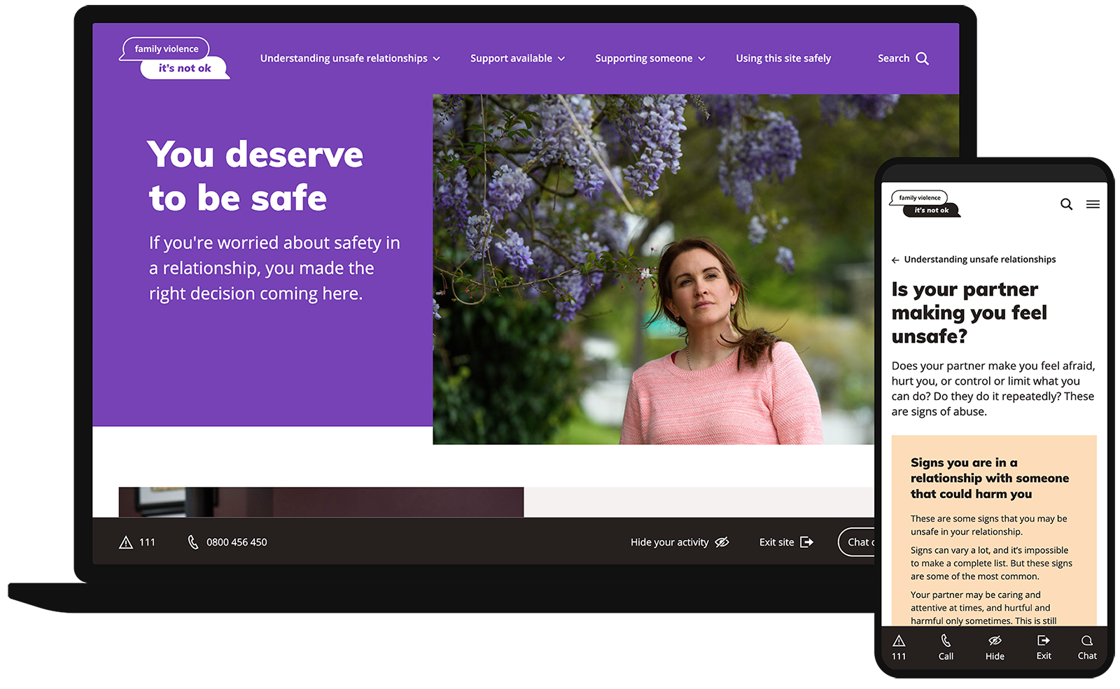
The purpose of this updated website for It’s Not OK is to provide easy-to-access and relevant information for people seeking support for family violence in New Zealand. Those worried about safety in their relationship, or their supporters, can understand their situation better and find pathways to immediate help.
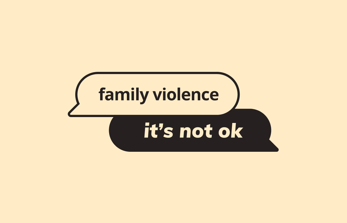
We worked with the Ministry of Social Development (MSD) to refresh their logo, re-design the website, and build an interactive relationship tool.
Project scope
Working closely with MSD, we helped redesign the site identity with a new logo and colour palette to connect more easily with those in a vulnerable position. The new tone and messaging became softer and less authoritarian, the imagery became more relatable and diverse.
When designing the website we had to take into account situational user experience. People may be accessing the site in a state of distress, or in locations and environments which are not safe. To make the site easier and, more importantly, safer to use, we implemented a number of unique functions. For example the site contains a sticky toolbar with links to “hide your activity” (which removes pages from the browser’s history) and an “exit site” button (which takes the user to a preloaded website, if they need to quickly change the page open in the browser due to being or feeling unsafe).
The team at Silverstripe gave us levels of determination, creativity, flexibility, and technical expertise that was first class, and demonstrated values that aligned seamlessly with ours and those of our partners.
Suzie Tingley
Manager Digital Communications, Ministry of Social Development
Relationship tool
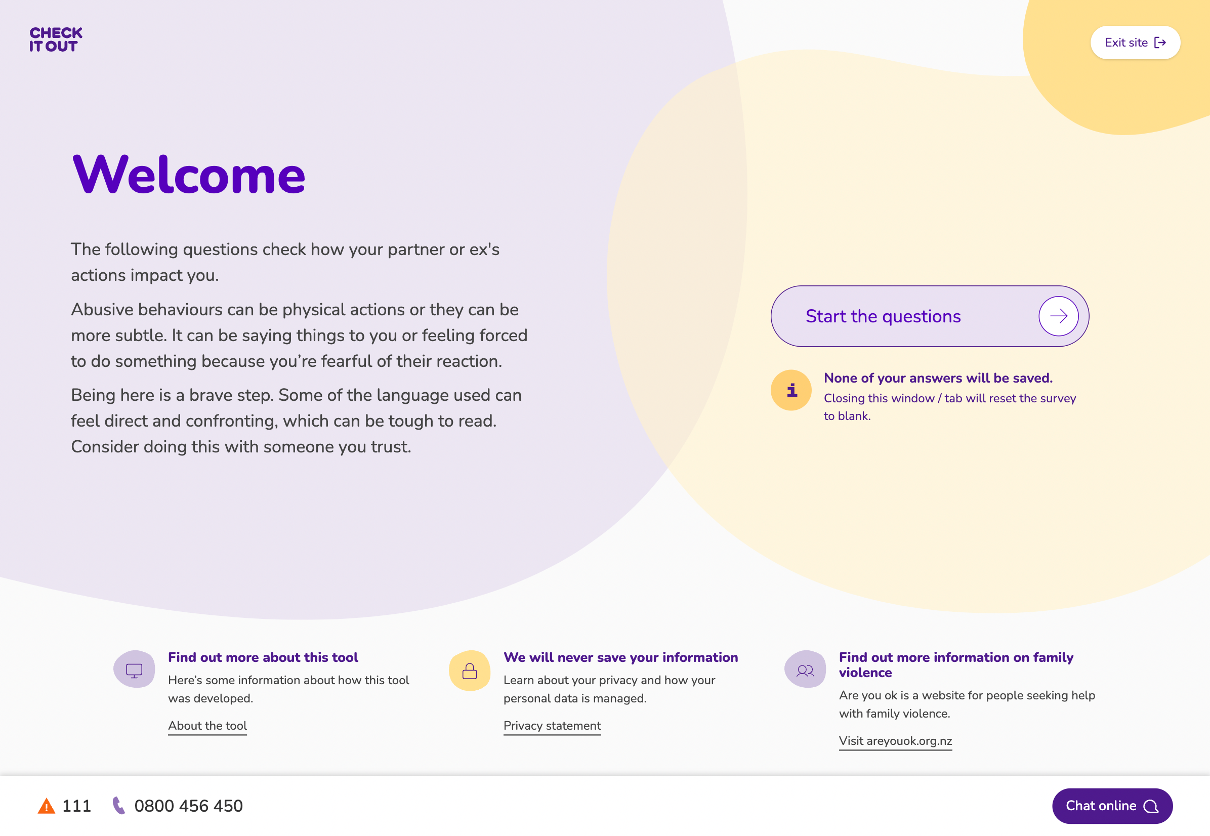
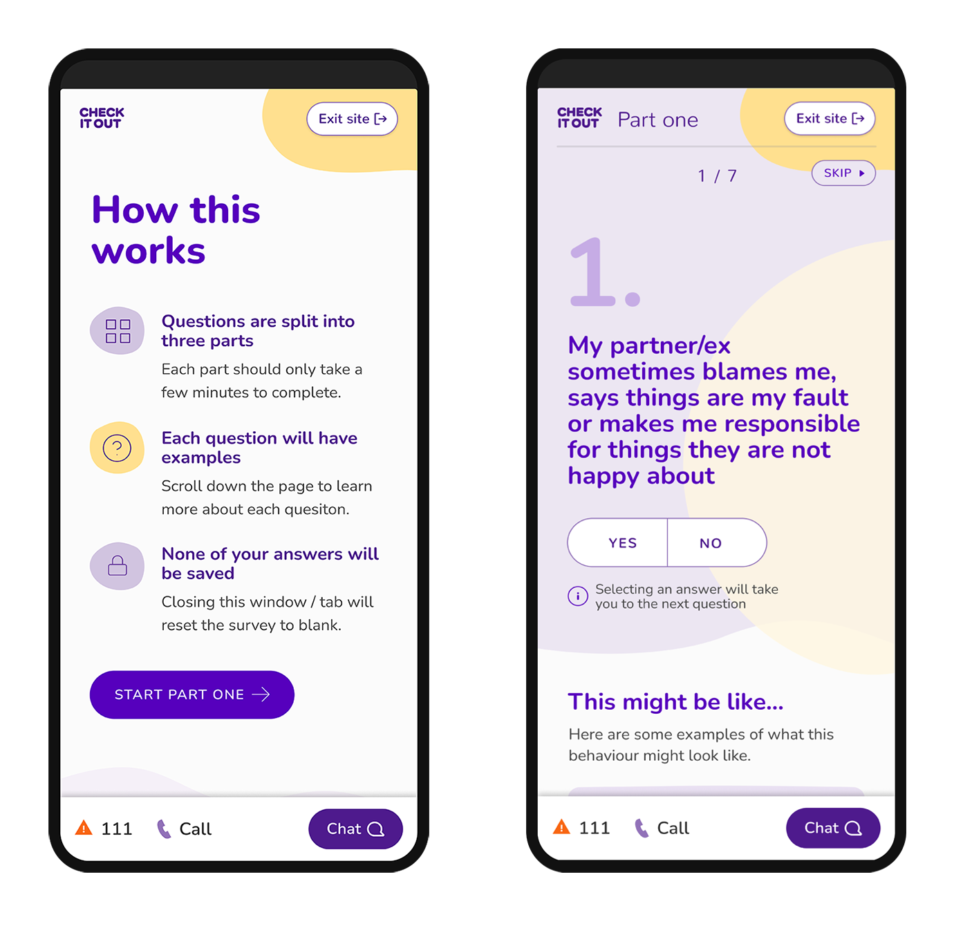
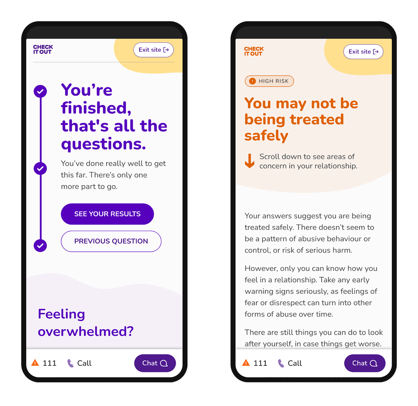
Building on previous work we also continued development of a dedicated tool to help users get insight into the types of potentially harmful behaviours in their relationship. By answering a series of questions, complete with examples, a user is able to get insight into how respectful the behaviours they are experiencing are their relationship is. At the end of the interactive questionnaire, users get customised results that highlight areas of concern and the steps they can take to become safe.
The tool, a standalone subsite (check.areyouok.org.nz), has a familiar but different visual identity to the It’s Not OK brand. This purposeful approach was taken to ensure the tool can sit standalone within a broad sector of family violence awareness websites, while at the same time feeling connected.
Key outcomes
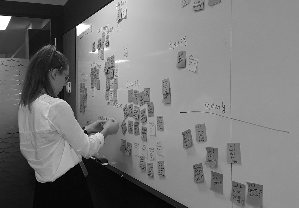
The website underwent rigorous user testing, including sessions with those with lived experience. As advocates of continuous improvement, we released early versions of the website and features, tested with real people, took on their feedback, and improved the UX and engagement based on their insights.
The result is a clear, calm and reassuring online entry to help those in danger, and for friends and whānau of those needing support.
Services provided
- Branding
- Visual identity
- Visual design system
- Project management
- Discovery workshops
- User testing
- Development
- Managed cloud hosting
Work with us
Whether you’re looking for a project partner who can help you realise your epic digital vision, or you need a hand with your website, we can help.


